
Material-ui는 UI framwork로 디자인에 도움을 주는 기능을 가지고 있다.
이번 2주 프로젝트를 하는 데 있어서 디자인 적인 측면을 보강하기 위해 Material-ui를 사용하기로 하였다.
그로인해 이번 포스트에서는 간단한 Material-ui 사용법에 대해 적으려고 한다.
전반적인 내용은 material-ui.com/를 참조하였으며, 홈페이지에서 예제를 적용하여 사용할 수 있다.
설치
npm이나 yarn을 통해서 설치할 수 있다.
// with npm
npm install @material-ui/core

// with yarn
yarn add @material-ui/core
SVG 아이콘 기능을 사용 하고 싶으면 다음과 같이 설치하면 된다.
// with npm
npm install @material-ui/icons

// with yarn
yarn add @material-ui/icons
이런 아이콘들을 가져다 사용할 수 있게 된다.
사용법
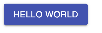
기본 사용법은 매우 간단하다. 공식 홈페이지에 나와 있는 예시 대로 사용하면 된다.
import React from 'react';
import ReactDOM from 'react-dom';
import Button from '@material-ui/core/Button';

function App() {
  return (
    <Button variant="contained" color="primary">
      Hello World
    </Button>
  );
}

ReactDOM.render(<App />, document.querySelector('#app'));
이렇게 입력하면 다음과 같이 출력된다.
홈페이지 commponent 예제 활용
material-ui.com/ 공식 홈페이지에서 commponet 예제를 그대로 가져와 사용할 수 있다.
commponent 페이지에서 가져오길 원하는 UI를 골라 copy the source 버튼을 눌러서 코드를 그대로 복사할 수 있다.
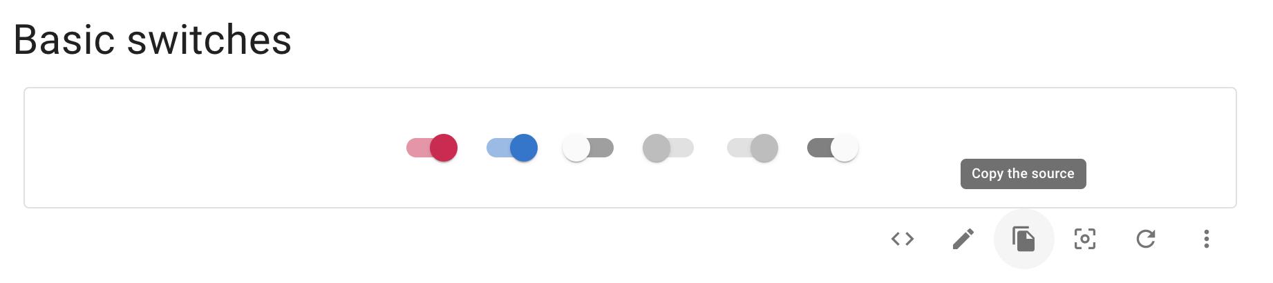
위 예시를 통해 복사한 코드를 그대로 붙여넣으면 다음과 같이 출력된다.
import React from 'react';
import Switch from '@material-ui/core/Switch';

export default function Switches() {
  const [state, setState] = React.useState({
    checkedA: true,
    checkedB: true,
  });

  const handleChange = (event) => {
    setState({ ...state, [event.target.name]: event.target.checked });
  };

  return (
    <div>
      <Switch
        checked={state.checkedA}
        onChange={handleChange}
        name="checkedA"
        inputProps={{ 'aria-label': 'secondary checkbox' }}
      />
      <Switch
        checked={state.checkedB}
        onChange={handleChange}
        color="primary"
        name="checkedB"
        inputProps={{ 'aria-label': 'primary checkbox' }}
      />
      <Switch inputProps={{ 'aria-label': 'primary checkbox' }} />
      <Switch disabled inputProps={{ 'aria-label': 'disabled checkbox' }} />
      <Switch disabled checked inputProps={{ 'aria-label': 'primary checkbox' }} />
      <Switch
        defaultChecked
        color="default"
        inputProps={{ 'aria-label': 'checkbox with default color' }}
      />
    </div>
  );
}
여기서 사용하고 싶은 코드만 추출하여 간단하게 사용 할 수 있다.
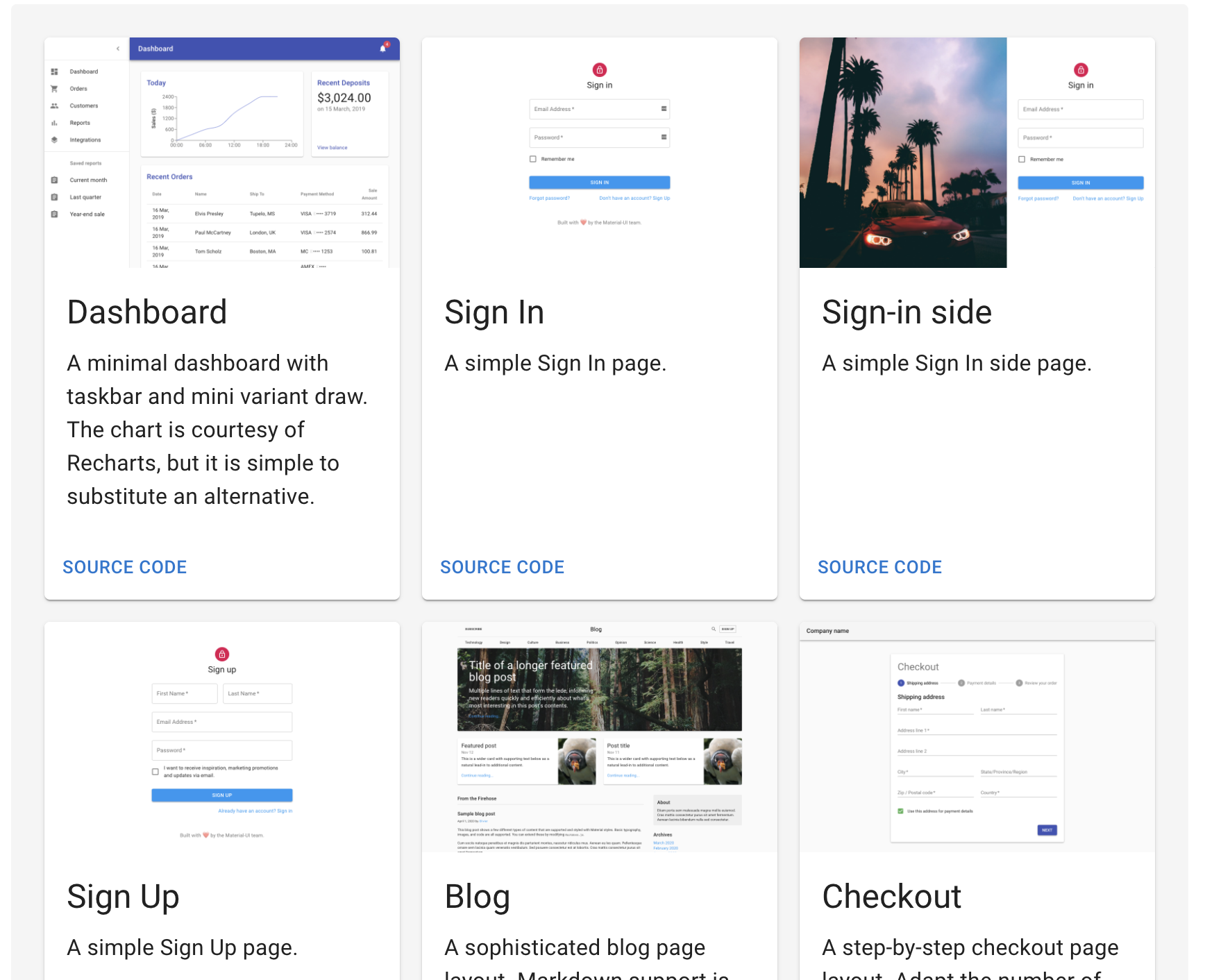
Templeate
공식 홈페이지 내에서는 간단한 템플릿도 준비 되어 있어서 간편하게 가져다 쓰기 쉬운 UI를 구현해 놓았다.
프로젝트를 진행하면서 막연히 어려웠던 CSS 나 디자인을 material-ui를 통해 간단하게 구현 할 수 있게 되었다.
물론 단점으로는 기존 디자인을 크게 변경하기는 어렵다는 점이 있지만, 빠르게 디자인을 구현할 필요가 있을때 유용하게 사용된다는 점이
material-ui를 사용하는 이유인 듯 하다.
'FRONT-END' 카테고리의 다른 글
| Redux-saga (0) | 2020.10.08 |
|---|---|
| [React Native]expo-cli 시작하기 (0) | 2020.07.18 |
| [Redux] 리액트 - 리덕스 적용 (0) | 2020.07.02 |
| [Redux]리덕스 시작하기 (0) | 2020.05.30 |
| [React]React Core Concept (0) | 2020.05.25 |


